THIS PAGE IS VERY WIDE AND WILL NEED SCROLLING ABOUT TO SEE IT ALL.
| I have often been asked for any painting tips. So here are some
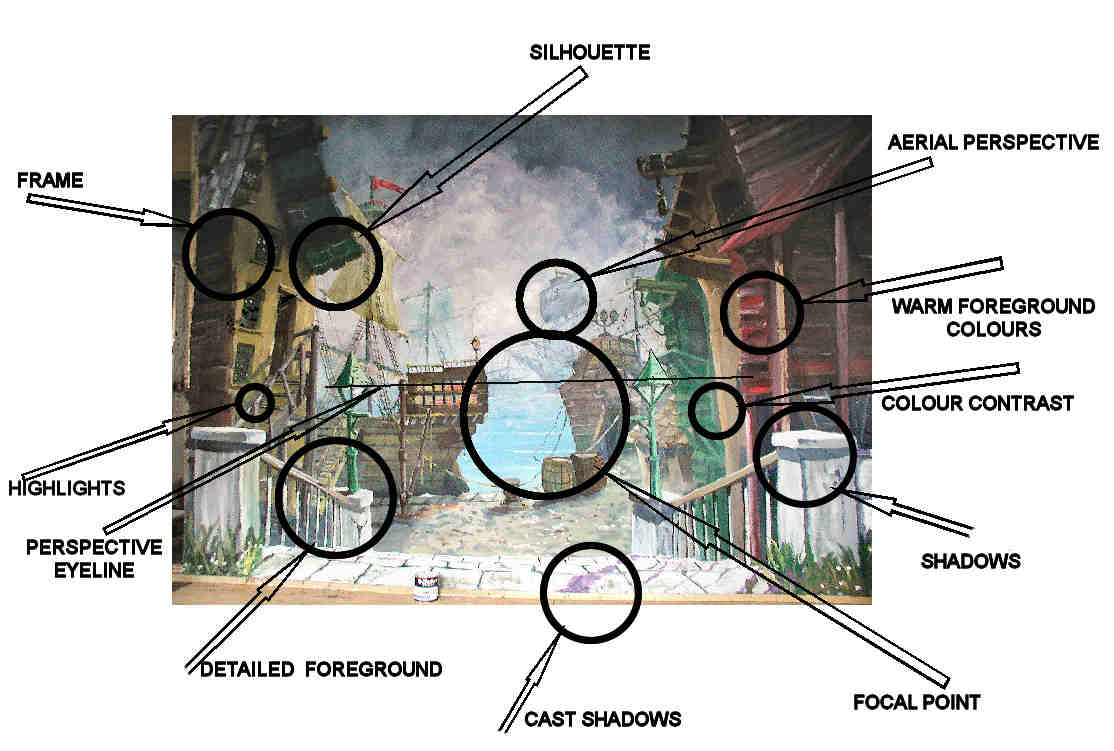
thoughts. I look upon painting stage scenery as falling into two distinct sections. CRAFT designing; constructing; cutting out; transferring etc ART When you are working close to a backcloth it is hard to visualize what the finished result will look like from the audience's point of view. So here are some tips which you can follow even when painting close to the cloth. I have taken the Dockside Backcloth as an example of some of these. Of course not every painting will have examples of all these ideas but many of mine do. |
| OVERLAPS | I suppose the most important need is to give a feeling of space
and depth. To infer depth perhaps your best ally is overlaps. Try
to overlap your elements. Some of my cloths will have up to twenty
items all overlapping each other in layers. Look at the right hand blue boat in the distance. In front of that is the stern of the galleon. In front of that stern are the barrels and the roof of the cottage. In front of the cottage is the lamppost on a pillar and in front of that are the steps. |
| THERE'S MORE | Infer there is more off stage. So when I paint a tree or building or any other element which is on the edge of the scene I only put part of it on to hint there rest is off stage. See my door on a previous page where even the "open" sign is not complete. (Page opens in separate window which will need closing) |
| SILHOUETTE | Make for interesting shapes. Silhouettes often also give attractive cast shadows. |
| AERIAL PERSPECTIVE | The colours degrade and detail is lost of distant objects. (due to dust in the air) Think mauve mountains |
| WARM FOREGROUND | An element painted in a warm colour i.e. reds or browns, appears
to be more to the fore than cold colours (greens and blues) So use
your warm colours for foreground elements . Conversely try to avoid
warm colours in the background. If I am painting a castle in the background I will paint the turret roofs blue instead of the traditional reds. (Opens in separate window which will need closing) |
| COLOUR CONTRAST | Find an excuse to use contrasting colours. |
| SHADOWS | Help to define the planes of an object and "explain" its shape. Decide where your sun is (or light source if an interior) and stick to that decision for all elements in the painting. |
| FOCAL POINT | Not necessarily a good thing!! Remember the actors need to dominate
- not the scenery. However I often try to have a focal point. And two - the focal point is in the middle of the scene. This is not recommended and usually gives a symmetrical look to the picture. However I know this cloth will not be mounted centrally on our particular stage (don't ask) so the focal point will be off centre. |
| CAST SHADOWS | Help to "explain" the texture and shape of the element upon which they fall. |
| DETAILED FOREGROUND | Make your foreground crisp and detailed. On rare occasions I will outline the foreground elements. But I stress this is rare and usually done to give a "Child's Book Illustration" style to the scene. |
| PERSPECTIVE EYELINE (HORIZON LINE) | Perspective is not really a very complicated subject. There's lots
of books which explain perspective in simple terms. Perspective is
paramount in helping to give depth. In the above Dockside scene it is no accident that the eyeline is the same height as the Horizon. This perspective eyeline line use to be called the "Horizon Line" but that term has lost favour because it is not necessarily the case (in mountains for instance) |
| HIGHLIGHTS | In moderation add interest and sparkle to a painting. Also shows the direction from which the light is coming. |
| FRAME | Not necessarily a good thing. But sometimes I will put a frame around a backcloth. The frame goes along the top and sides but not along the bottom. A frame along the bottom would put a "barrier" up between the action on the stage and the painted background. I will use a frame especially if the backcloth is the only piece of scenery on the stage i.e. no wings. I usually frame with darker colours and interesting shapes. But remember any painted wings are part of the painting and become your frame. Darker colours at the top of the cloth also help the transition from cloth to the stage borders which are inevitably black. See the flowers and foliage on this cloth (Opens in separate window which needs closing) |
| FULL SIZE FOREGROUND | If there are wings then I usually paint them full size (i.e. a door
will be painted six feet high) However if it's only a backcloth then
I try to organise an element in the foreground of that cloth which
is full size i.e. a fence post or mile stone or bridge. A full size
element helps to anchor the scene to the stage so that when an actor
is near the cloth they don't appear to be giants. The pillars in the
foreground at the top of the steps are full size in the above Dockside
scene. Click here to see how NOT to do it! (Opens in separate window which needs closing) |
| MISTING. | A trick I use to show one element is in front of another. Scrub a thin layer of translucent white paint over the place on the background element where the foreground element overlaps it. I have done this behind the two lamp posts in the above Dockside painting. I have also misted out any detail behind the steps' railings. |
| CLASHES | I desperately try to avoid any clashes of edges and had great problems with this in the above scene. Everything seemed to end up meeting the edge of something else. Perhaps the worst/best example of this is the right hand railings of the above painting. Note how the edge of the "Orangy" building exactly coincides with one of the railings. I should have repainted that offending rail. Too late now. |
| A WAY OUT | Try to always include a way out for the eye in your design. By this I mean avoid making your painting claustrophobic. Give the eye a way out. So for an interior scene don't have a blank wall but at least paint in a window, door or stairs leading out of the picture. The same applies in an exterior scene. Put in a path, or style, or steps. As well as opening up the scene these elements also add a sense of mystery (I wonder where that path or door leads to?) |
| CONTRASTING SHAPES | To make a backcloth lively and interesting seek out an excuse to use interesting shapes |